The best type of navigation (nav) for your site depends on your site's content and underlying structure. RDS ships with several navigation options to meet your site's needs in this area.
Nav types
For the CU theme, RDS has two types of site-wide, primary navigation types:
- Top nav
- Side nav
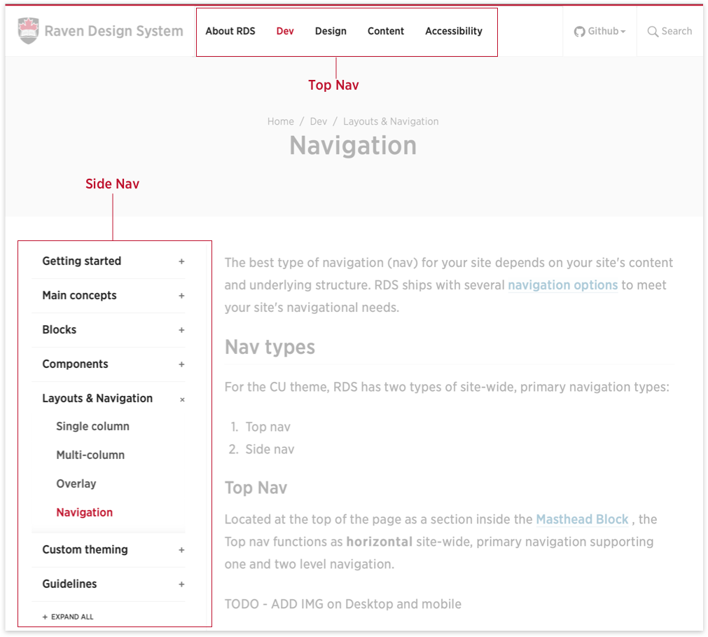
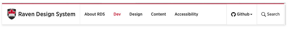
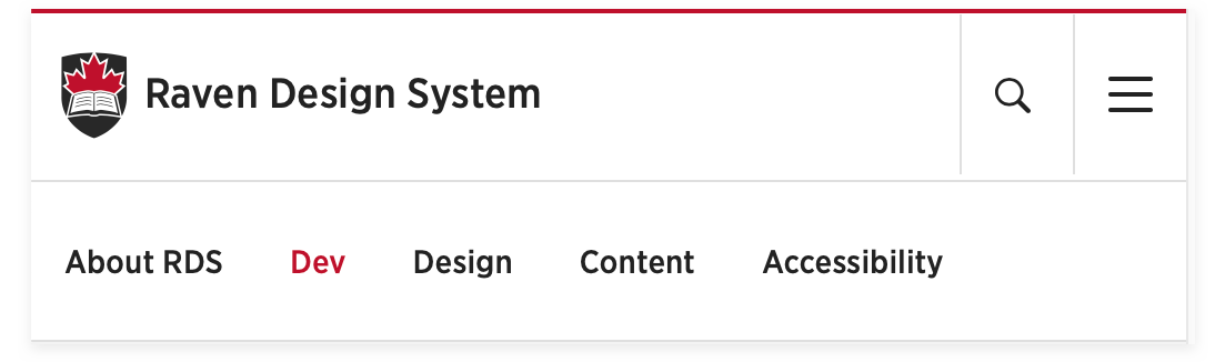
Top Nav
Located at the top of the page as a section inside the Masthead Block , the Top Nav functions as horizontal, site-wide primary navigation supporting one and two level* navigation.
* available only when using the Responsive Top Nav option.
Side Nav
Located further down the page, along side of the content, the Side Nav can function as both top-level or section-specific navigation supporting one, two and three levels of hierarchy.
The Side Nav uses the Menu Block and the Overlay layout as it gets hidden on small screens.
Nav options
Both navigation types have advantages and disadvantages, as well as their own use case requirements. Between the two nav types, four navigation options are available:
1. Basic Top Nav

Because of its discoverability, the Basic Top Nav is the best navigation option for any CU theme site. However, it is rarely available because you need to fit all your Masthead elements, in one row, on small screens. It is also limited to just one level of navigation hierarchy.
To use the Basic Top Nav, you:
- likely, require a short site title.
- are limited to a small number of top level nav items, without long names.
- can only use a limited amount, or no, Masthead action items. The good news here is you won't need a mobile nav icon. But if, you want a search button, it gets that much tighter.
While this nav is limited to one level, you can use button submenus to fit in more navigation items. But, you need to make sure they also have enough space for proper viewing. If so, this does provide the ability to have bigger sites and still use the Simple Top Nav.
Pros
- The Basic Top Nav is the best because it is super discoverable in that it is always in the same place and always visible across all screen sizes.
- This menu requires zero JavaScript to run and resize scripts, required for the other Top Nav option, do not need to fire.
- The [single column layout] is available using this navigation.
Cons
- You have limited space for Masthead items. To use this nav, it is imperative you make sure everything fits on the smallest screen size. If you need more horizontal space, you can use the Responsive Top Nav option.
- Limited to only one level of navigation.
- Limited space for clickable popup menus.
- Not available if you need more then two levels.
Usage
Use the Simple Top Nav if:
- you have a small site with just a few pages, or a single page app.
- all your pages are at the top level and no sub-navigation is required.
- or your top-level section names are concise and there is space for your submenus
Example
Minimize your screen as much as you can here or on the Codepen example page. Notice how in the example below everything in the Masthead fits in a single row on all screen sizes.
See the Pen RDS - Nav - Simple Top Nav by Carleton (@cuweb) on CodePen.
Important code difference between the Basic Top Nav and the Responsive Top Nav: for the former you don't need to add the b-masthead--responsivenav modifier class. By not adding this you are stopping the JS to fire and saving some resources.
<!-- you do not need the modifier -->
<div class="b-masthead">
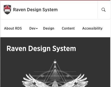
2. Responsive Top Nav
On larger screens, the Responsive Top Nav tries its best to fit your navigation in the top row.
If space becomes unavailable, it drops down to it's own line.
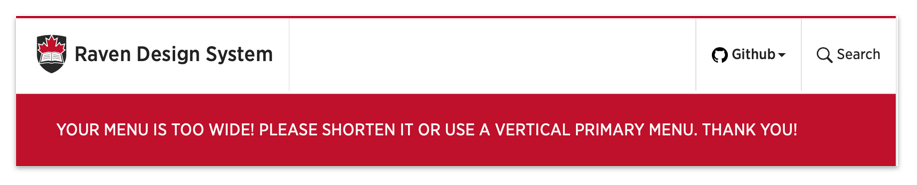
Important: on large screens above 960px, if the nav has dropped and overflows again you have broken this navigation option.
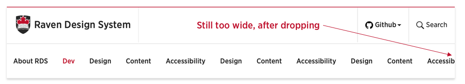
In this scenario, if you resize your browser, you will get a big error message. It is crucial you check your Top Nav menu's on all screen sizes and you don't ship your site with this error.
On smaller screens, below 960px wide, the Responsive Nav always drops to a second row. Touch devices are being detected and overflow is acceptable enabling users to swipe the nav to show hidden menu items offscreen.
Supported levels
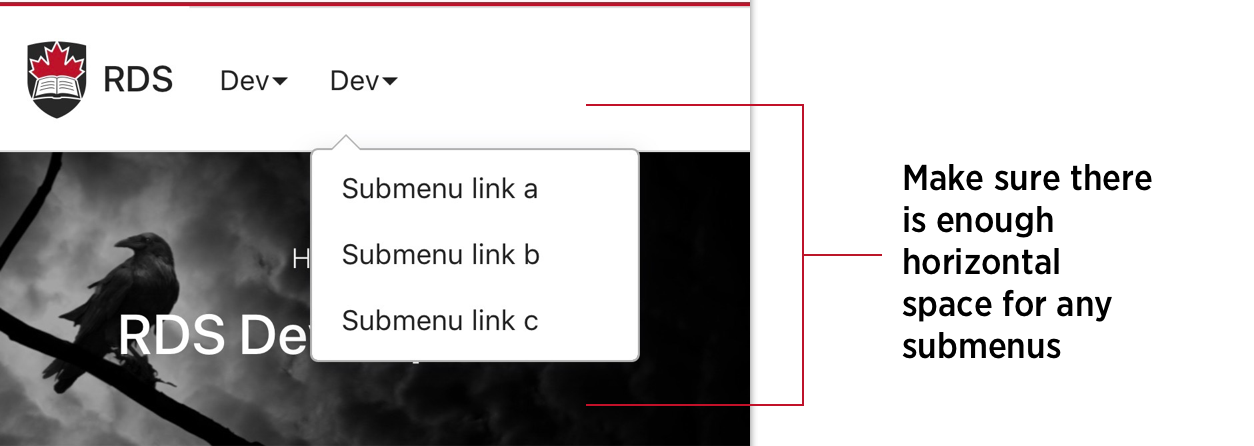
The Responsive Top Nav supports two levels of navigation. If you require three levels you will need to use the Side Nav in some capacity.
Important: when using the Top Nav and the Side Nav on the same page, you should never use popup submenus in the Top Nav.
Pros
- The Responsive Top Nav is visible on all screen sizes
- While limited, the menu can hold a fair amount of navigation items
- The [single column layout] is available using this navigation.
Cons
- You are restricted to a maximum of two levels in your navigation structure.
- The offscreen responsive horizontal scrolling menu might not be as perceivable to all users.
Usage
Use the Responsive Top Nav if:
- you have a small to medium amount of pages in your site.
- you don't have more then two levels in your navigation
Example
See the Pen RDS - Nav - Responsive Top Nav by Carleton (@cuweb) on CodePen.
Important code difference between the Basic Top Nav and the Responsive Top Nav is that with the latter you need to add the b-masthead--responsivenav modifier. By not adding this you are stopping the JS to fire and saving some resources.
<!-- you do not need the modifier -->
<div class="b-masthead b-masthead--responsivenav">
😎 Pro tip: Sliding Top Nav on Homepage
As seen on smaller screens at apple.com, if your Top Nav overflows on small screens, consider sliding out the navigation to remind users this is a scrollable area. To avoid this feature becoming redundant for users, it should probably only be enabled on your home page. For an example, check this site's home page on a small screen.
If you have an overflowing top nav below 640px, to use this feature:
- add a class of
homepageto the<body>tag of your homepage.
<!-- this would likely be done dynamically in some way -->
<body{% if page.homepage == true %} class="homepage"{% endif %}>
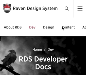
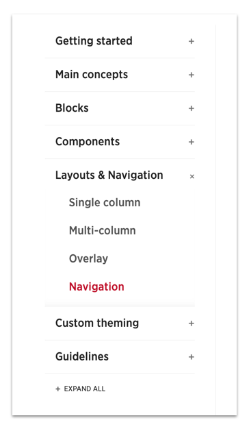
3. Side Nav
As vertical navigation, the number of items available in the Side Nav has no limit. The navigation makes sense for large sites or sites that will likely grow causing you to have an undetermined amount of nav items. Below is a screenshot from the Side Nav used on this page (<-- to the left of this text).
The Side Nav can handle up to three levels of navigation hierarchy. On the homepage the Side Nav only displays the top level, but each section or the entire nav can be expanded enabling users to see the entire menu.
Pros
- The Side Nav is great for sites with lots of pages, or an indeterminate amount of pages.
- On large screens (desktop), this nav is super discoverable.
- It is the best navigation if you expect your site to grow in terms of pages and sections.
Cons
- The single column layout is NOT available using this navigation.
- The menu is less discoverable on mobile, requiring users to click the mobile nav icon to access it. Although, this has become a familiar pattern for mobile users.
Usage
Use the Side Nav if:
- you have a large site and/or require three levels of navigation.
- you have a lot of menu items and/or items with long names that wouldn't fit in the Top Nav.
4. Top Nav and Side Section Nav
For large sites with distinct top-level sections, you can use both the Top Nav and the Side Nav on the same page. In this case, your Side Nav becomes section navigation for one of your top-level sections enabling up to four levels of navigation.
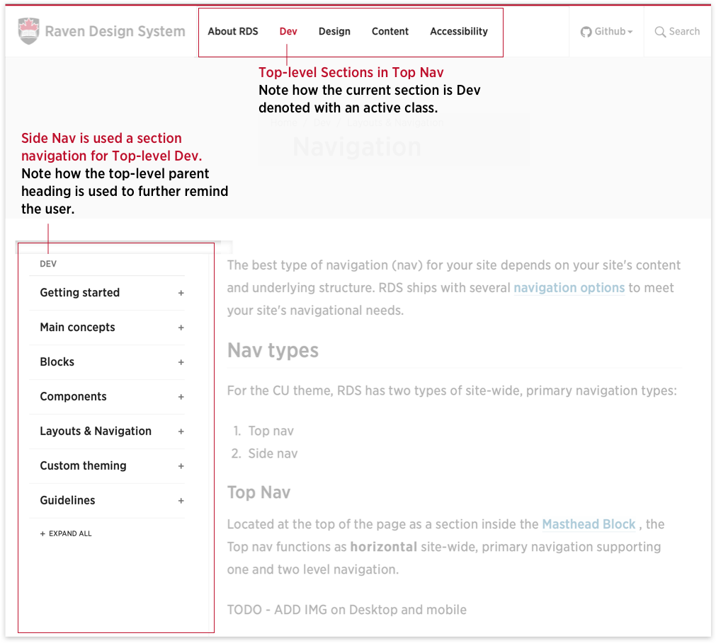
This site, the RDS docs, is a good example of both navigation types being used together. Notice how the top nav does not contain sub menus. Across your site, some sub sections may not require a side nav. This is fine. However, your Top Nav must remain consistent site wide.
Pros
- Using both nav types is great for sites with lots of pages with distinct top-level sections.
- It provides an additional fourth level sites requiring deep navigation.
Cons
- This add a layer of complexity to your overall navigation. While sometimes necessary, the simpler you can keep your navigation structure the better.
Usage
Use the Side Nav if:
- you have a large site and require four levels of navigation.
Navigation: key terms
Let's make sure we are all on this same page when referencing navigation terms used on this page.
Navigation levels
The number of levels within navigation is ultimately determined by the site hierarchy. Ideally, the fewer levels people need to click through, the better.
- One level navigation equates to a flat structured site without nested sub-sections, only (parent) top-level pages.
Homepage/
├── About
├── Products
└── Contact
- Two level navigation equates to a site structured with top-level pages (parent) and (at least one) nested sub-pages (children).
Homepage/
├── About
|   ├── Our History (child of About)
|   └── Our People
├── Products
└── Contact
- Three level navigation equates to a site structured with top-level (parent) pages, nested (child) sub-pages and nested (grandchild) sub-sub-pages.
Homepage/
├── About
|   ├── Our History (child of About)
|   └── Our People
|       └── Office of the CIO (grandchild of About)
├── Products
└── Contact
- Four level navigation is the deepest an RDS site can go. This is for large sites with a vast amount of content and hierarchy requirements, such as these docs. To achieve four levels a combination of Top Nav and Subsection Side Nav is required.
Homepage/
├── About
|   ├── Our History (child of About)
|   └── Our People
|       └── Office of the CIO (grandchild of About)
|           └── CIO Bio (great grandchild of About)
├── Products
└── Contact
Primary navigation vs secondary navigation
Primary navigation is the main menu used to move around the site with links to pages and content that the users are the most interested in. Primary navigation can contain multiple levels.
Secondary navigation is for content that is of secondary interest to the user and is located outside of the primary nav.
TODO show links below left side nav
This page is always referencing primary navigation.
Top level navigation vs section navigation
In large sites, primary navigation is sometimes split up into:
- Top level nav: with links to top level pages
- Section nav: focusing on links available within a certain section the user finds themselves in. This is not the same as secondary nav, as it is primary and likely more important as the user has navigated there.
TODO: add image.
Best Practices
The best navigation is both consistent and discoverable.
Prioritize Consistency
When it comes to site navigation, it is important to maintain consistency. Whichever option you decide to go with, use it consistently across your entire site. Consistently using the options below across Carleton sites will enable our users to become familiar with RDS navigation patterns.
Focus on making navigation discoverable
Navigation that is discoverable and findable, especially on mobile, works best for the user experience. While it is up to you to determine which option works best, they are presented below in a general order of discoverability and best practices.
References
https://www.butterfly.com.au/blog/design/10-steps-for-better-website-navigation