RDS Blocks are the equivalent of components in other design systems and modern frameworks. Blocks are chunks of reusable code that can be assembled in different combinations to build any number of user interfaces.
This page provides a must-read, deep dive into RDS Blocks.
Block guidelines and rules
In their simplest form, RDS blocks are grouped snippets of well formed HTML, styled by CSS, and sometimes controlled by JavaScript. The user interface (UI) equivalent to Lego blocks, RDS blocks make up a distinct UI section that you can easily attach together to build interfaces. Unlike a tub of random sized/coloured Lego blocks, RDS blocks are more the equivalent to Lego blocks found in themed Lego sets as there are rules and guidelines to follow.
This page covers the following block rules and guidelines:
- block utility classes and types
- block handles and naming
- block section restrictions
- block headings
- block properties and data
- block variants
Simple block example
To use as an example throughout this page, lets create a basic block with just a paragraph of green text and a horizontal rule. We will give it the name Simple block.
Here is what our Simple block looks like:
This is Simple block, an example of a basic block for learning purposes.
And the markup, which we will break down later:
<div class="u-block u-block--white">
    <div class="b-simple">
        <p>This is Simple block, an example of a basic block for learning purposes.</p>
        <hr>
    </div>
</div>
Block utility classes
Block utility classes are used to bring a rhythm and a familiar flow from page to page by standardizing layout and controlling a block's width, spacing and colour.
All blocks must be wrapped with the utility class u-block. This convention helps to locate where blocks exist in your source code.
<div class="u-block">
</div>
Block width types
RDS blocks are either fixed-width or full-width.
Fixed-width blocks
Fixed-width blocks have a maximum width and standardized side padding.
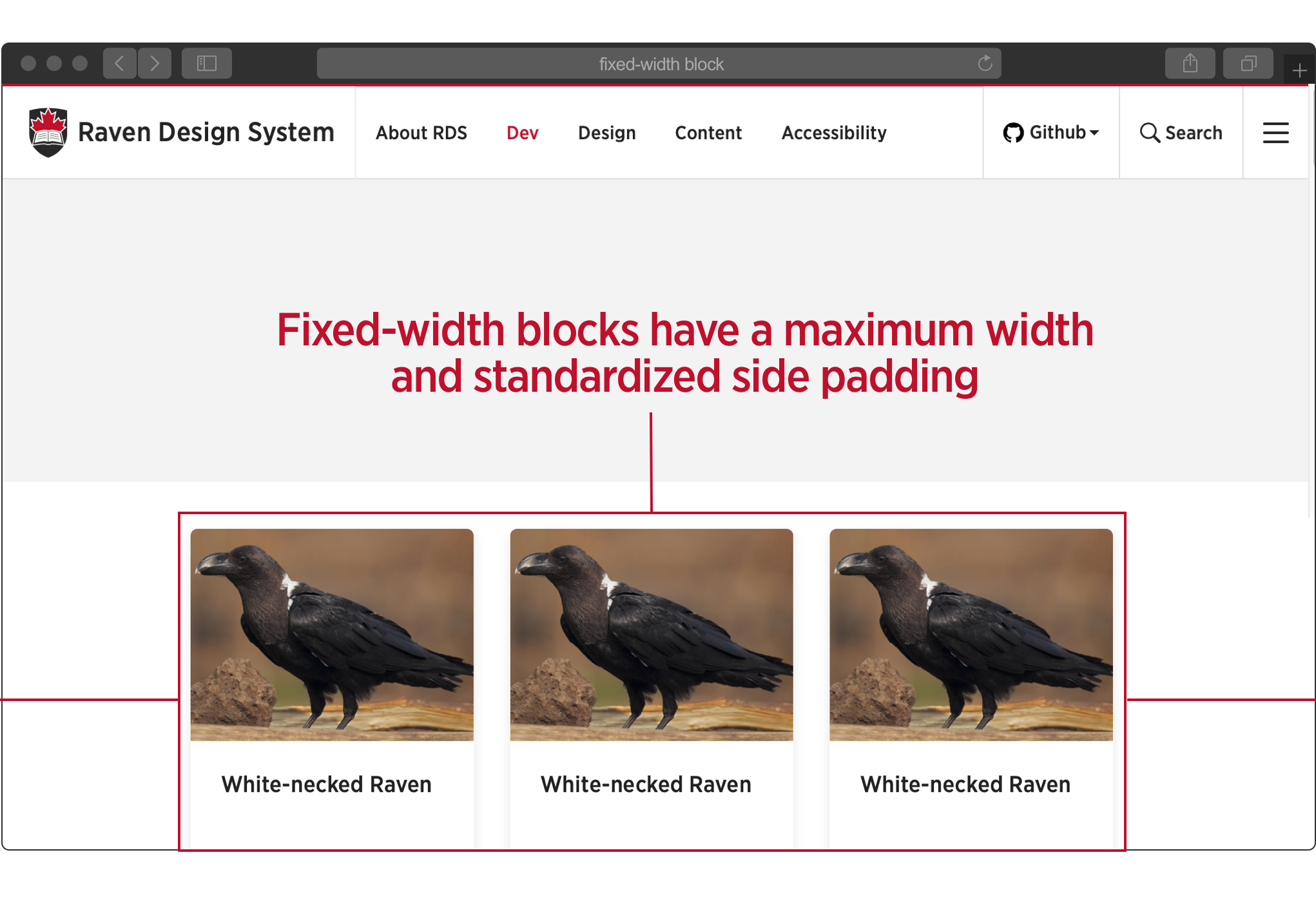
By default, blocks are fixed-width, which is set by the required 'u-block' clas.
Note: Our Simple block example is a fixed-width block.
<div class="u-block u-block--white">
    <div class="b-simple">
        <p>Our Simple block is a fixed-width block, set by the required u-block class.</p>
        <hr>
    </div>
</div>
Our Simple block is a fixed-width block, set by the required u-block class.
Full-width blocks
Full-width blocks, such as the Masthead block, span the entire width of the screen.
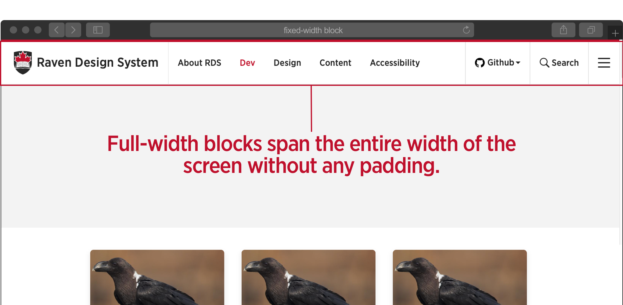
Notice what happens to our Simple block if we add the modifier u-block--full.
<div class="u-block u-block--full u-block--white">
    <div class="b-simple">
        <p>This is Simple block, an example of a basic block for learning purposes.</p>
        <hr>
    </div>
</div>
This is Simple block, an example of a basic block for learning purposes
Our Simple block now spans the full-width of the window and no longer has padding surrounding the block.
Note: block widths are ultimately controlled by their layout containers. Full-width blocks are primarily used in single column layouts.
u-block color modifiers
The u-block colour modifier controls the block's background colour. Available values are:
u-block--whiteu-block--greyu-block--black
Returning to the original implementation of our Simple block, notice it uses the u-block--white modifier.
This is Simple block, an example of a basic block for learning purposes
<div class="u-block u-block--white">
    <div class="b-simple">
        <p>This is Simple block, an example of a basic block for learning purposes.</p>
        <hr>
    </div>
</div>
To change the background color to grey, lets replace u-block--white with u-block--grey.
<div class="u-block u-block--grey">
    <div class="b-simple">
        <p>This is Simple block, an example of a basic block for learning purposes.</p>
        <hr>
    </div>
</div>
This is Simple block, an example of a basic block for learning purposes..
Notice that while the content remains fixed in width, the block's grey background extends the full length of the window. This allows us to create blocks with differing background colours that appear as rows with predefined spacing.
Use different coloured background rows to separate different sections of content.
This is Simple block, an example of a basic block for learning purposes
This is the Simple block being used for a section with different content. So we have changed the background colour to better seperate it from the block above and below.
This is Simple block, an example of a basic block for learning purposes
<div class="u-block u-block--grey">
    <div class="b-simple">
        <p>This is Simple block, an example of a basic block for learning purposes.</p>
        <hr>
    </div>
</div>

<div class="u-block u-block--white">
    <div class="b-simple">
            <p class="b-simple">This is the Simple block being used for a section with different content. So we have changed the background colour to better seperate it from the block above and below.</p>
        <hr>
    </div>
</div>

<div class="u-block u-block--grey">
    <div class="b-simple">
        <p>This is Simple block, an example of a basic block for learning purposes.</p>
        <hr>
    </div>
</div>
Rule: Block nesting is prohibited
Functionally independent, a block can NOT be nested within another block.
<!-- 👍 Cool, like Fonzie -->
<div class="u-block u-block--grey">
    <p class="b-simple">This is Simple block, an example of a basic block for learning purposes.</p>
    <hr>
</div>
<div class="u-block u-block--grey">
    <p class="b-simple">This is Simple block, an example of a basic block for learning purposes.</p>
    <hr>
</div>
<!-- 🦈 Jumping the shark...not cool -->
<div class="u-block u-block--grey">
    <div class="u-block u-block--white">
        <p class="b-simple">This is Simple block, an example of a basic block for learning purposes.</p>
        <hr>
    </div>
    <p class="b-simple">This is Simple block, an example of a basic block for learning purposes.</p>
    <hr>
</div>
Block section restrictions
While blocks can be stacked in any order to build interfaces, they are restricted to specific page sections. Sections are denoted by semantic HTML 5 elements on your page, including:
- Header -
<header> - Main -
<main> - Aside -
<aside> - Footer -
<footer> - Dialog -
<dialog>- this the default off-screen overlay.
For example, the Content block (b-content) can only be used within the <main> section.
Some blocks can be used in multiple sections. For example, the Search block (b-search) can be used inside both the <header>, <aside> and <dialog> sections.
Sections restrictions are noted in each block's documentation.
Note: While an HTML document can have multiple <header> and <footer> elements. In RDS, the 'Header section' is always denoted by the first <header>Header section</header> on the page and the 'Footer section' by the last <footer>Footer section</footer>.
Example of section restrictions using Simple block
Lets say our Simple block is restricted only to the <main> section.
Cool:
<main>
    <div class="u-block u-block--white">
        <p class="b-simple">This is the Simple block being used for a section with different content. So we have changed the background colour to better separate it from the block above and below.</p>
        <hr>
    </div>
</main>
Not cool:
<header>
    <div class="u-block u-block--white">
        <p class="b-simple">This is the Simple block being used for a section with different content. So we have changed the background colour to better seperate it from the block above and below.</p>
        <hr>
    </div>
</header>
Block naming and handles
Each RDS block requires a unique name and corresponding handle. A block's name refers to its proper name written in title case. A block's handle refers to its unique computer-friendly name for use in code and file naming.
Block handles must:
- be lowercase.
- be one word without spaces or dashes.
- follow RDS naming conventions. For example, the Text and Image block's handle is
'textimg'which uses the system's abbreviations. - mirror its full name as best as possible.
Simple block handle example
While our example block's name is Simple block, its handle is 'simple'.
After the u-block utility class wrapper, the first HTML element's class name must follow this pattern:
b-[handle]
The b- prefix further identifies where the block begins as seen in the Simple block's markup:
<div class="u-block u-block--white">
     <p class="b-simple">This is the Simple block being used for a section with different content. So we have changed the background colour to better seperate it from the block above and below.</p>
    <hr>
</div>
The CSS for our Simple block would be:
.b-simple {
    color: green;
}
Handles for folder and file names
A block's handle is used to identify all of its associated files and folders.
If you're using a package manager like npm, to include RDS in your project, the file structure for importing a block's SCSS and JS modules looks like this:
your-project/
└── node_modules/
    └── rds
        └── blocks
            └── masthead
                ├── masthead.js
                └── masthead.scss
Notice how the Masthead's handle comes into play in the file and folder naming above. If we added our Simple block as a custom block, our folder structure would be similar to this:
your-project/
├── blocks
│   └── simple
│       └── simple.scss
└── node_modules/
    └── rds
        └── blocks
            └── ...
Note: if you are building custom blocks, read the custom theming documentation. Custom blocks not included in the RDS package have a different naming convention:
b-[theme short name]-[block handle].
Block headings
Some fixed-width blocks can have headings. Our Simple block is an example of a block that can have a heading:
Simple Block
This is Simple block, an example of a basic block for learning purposes..
The header HTML resides between the u-block utility class and the block's first class name starting with b-.
 <section class="u-block u-block--white">
    <h2 class="c-heading">Simple Block</h2>
    <p class="b-simple">This is Simple block, an example of a basic block for learning purposes.</p>
    <hr>
</section>
Notice how the utility block wrapper <div> was changed to a <section> tag and an h2 was added above the b-simple tag. Switching the div to a section is encouraged when using a block heading to help associate the heading and block as a standalone section.
Block headings make use of the Heading component which has a couple of options for styling headers. One option for single column layouts is centered headings by using the --center modifier..
 <section class="u-block u-block--white">
    <h2 class="c-heading c-heading--center">Simple Block</h2>
    <p class="b-simple">This is Simple block, an example of a basic block for learning purposes.</p>
    <hr>
</section>
Simple Block
This is Simple block, an example of a basic block for learning purposes..
For all heading options, view the Heading component documentation.
Block Variants
Variants change the appearance and/or context of a block, with modifier classes. Variants are used to extend a block when it has different possible implementations, but has the same functionality and/or similar appearance. This allows for DRYer code by sharing existing CSS and template HTML. The Listing block is an excellent example of a block with several variants.
Block variant example using Simple block
If we needed the exact same block as Simple block, but with red text instead of green, it does not make sense to create a new block. Instead, lets add a variant using a modifier class.
<div class="u-block u-block--white">
    <p class="b-simple b-simple--red">This is a variant of Simple block, using red text instead of green.</p>
    <hr>
</div>
This is a variant of Simple block, using red text instead of green.
The CSS for our Simple block Red Text variant would be:
.b-simple {
    color: green;
}

.b-simple--red {
    color: red;
}
Blocks In-Depth
At this point you should have the required information for integrating RDS blocks into your templates. The section below dives a little deeper into concepts intended for RDS and theme developers.
Block props
Preface: this section is very conceptual. Without knowing whether you are using a backend language such as PHP, or a front-end language like React to setup your templates and integrate your data, it is impossible to give specific details. The concepts here are to get you thinking about separating your data from your template code and should apply across varying frameworks.
Blocks are grouped HTML, CSS and sometimes JS partials working together to form reusable user interface elements. While they are reusable, they need to be rendered in many different ways with different data.
Props, short for properties are a way to accept data to control the block's settings or output. Block props are variables with data, often coming from typed fields set on a specific instance of a block to be referenced from within its markup. Blocks accept data to output a unique version of itself with that data.
As we have seen, the Simple Block might use a different colour background and would definitely use different paragraph text with each implementation. So the Simple blocks template code might be:
<div class="u-block u-block--{{settings.color}}">
    <p class="b-simple">{{prop.text}}</p>
    <hr>
</div>
In the code above, the block props are denoted by the vars in the {{}} mustache braces: {{settings.color}} and {{prop.text}}.
If we wanted to display the above template as:
This is the Simple block with a grey background.
...we would make sure to pass the block's props the following data:
- 'settings.color' = 'grey'
- 'prop.text' = 'This is the Simple block with a grey background.'
...so our DOM rendered HTML ended up as:
<div class="u-block u-block--grey">
    <p class="b-simple">This is the Simple block with a grey background.</p>
    <hr>
</div>
Notice how the block's background prop was named {{settings.color}}, while the other one is prop.text.
When setting up your template logic to access prop values, consider separating props that control block settings, including:
- block width - (
u-block--sandu-block--l) - background colour - (
u-block--whiteandu-block--grey) block variants
Prop types
With the exception of include blocks, all blocks require props to capture specific value types:
- text: alphanumeric string of letters, numbers, and (in some cases) symbols.
- numbers: must be numeric characters.
- date/time: properly-formatted Date and/or Time allowed in your language used.
- boolean
Prop data restrictions
Some props have character limits, indicating that the strings will be cut off at a set length.
Required props
Some props must receive values, while other are optional.
Example of feeding values to block props
If you had a simple block template set up in the following macro...
{% macro simple(settings, ) %}
<div class="u-block u-block--{{ settings.color }}>
    <h2>{{ b.title }}</h2>
    <p>{{ b.excerpt }}</p>
</div>
{% endmacro %}
...and wanted to render the following HTML.
<div class="u-block u-block--grey">
    <h2>Hello world</h2>
    <p>Lorem ipsum</p>
</div>
Which would look like this:
Hello world
Lorem ipsum
...a JSON schema could look like this:
{
  "settings": [
    {
      "bgcolor": "grey"
    }
  ],
  "fields": [
    {
      "title": "Hello world",
      "excerpt": "Lorem ipsum"
    }
  ]
}
To change your output to:
<div class="u-block u-block--black">
    <h2>Darkness</h2>
    <p>Lorem ipsum</p>
</div>
Darkness
Lorem ipsum
Your JSON would look like this:
{
  "settings": [
    {
      "bgcolor": "black"
    }
  ],
  "fields": [
    {
      "title": "Darkness",
      "excerpt": "Lorem ipsum"
    }
  ]
}
Recommendation only: This is just one recommended approach. How you set up your templates is ultimately up to you. We do provide templating examples that follow this pattern.
Available components
For DRYer code, many blocks contain components in their markup. Optional components are available for some blocks. For example, the [Content block] can contain the following components: c-blockquote, c-table, c-form, c-accordion.
Block documentation
Each RDS block has it's own documentation on this website providing examples, uses cases, design and code references detailing most of the concepts above. Before integrating a block, we suggest you visit it's documentation page.
Principles
We should be writing as little CSS & JavaScript as possible
- theme?
- qa
Blocks allow us to separate RDS UI into smaller, more manageable parts and provide consistent user experiences across all RDS platforms.
What does making blocks with love mean?
It means:
- All blocks need to be crafted in a meticulous manner with a focus on accessibility, clean, semantic markup and lean CSS styles while following the design system standards guiding their creation and use.
- All blocks need to go through a Release Management process where they are well-tested on all browsers and platforms. Multi-step code reviews and quality assurance are required before any block can be released in the wild.
- All blocks need to be documented and commented enough to be easily integrated and expandable in future.
-
References
- Building A Static Site With Components Using Nunjucks
- How to Modularize HTML Using Template Engines and Gulp
- An Overview of JavaScript Templating Engines
themes also have handles. For custom blocks the formula for a block's class name is "b- + {theme handle} + {block handle}". For example, the class name for a new block called "Foo" in a custom theme with the (theme) handle of "cu" would be b-cu-foo.
By following these conventions, we can avoid conflicts and easily distinguish custom blocks from core RDS blocks. If a block's primary class name has one hyphen (b-content), we know it is a core block. Consequently, if a block's primary class name has two hyphens (b-cu-foo), we know it is a custom theme block.
Also, the "Doe Ray Me" named block above is used to exaggerate a point. You should keep block names to two words max while trying to describe their use case as best as possible. We know, naming in programming is hard.
Block versioning
RDS uses Semantic Versioning (SemVer). In addition to maintaining a SemVer for the RDS core package, each block and component maintains it's own version.
MINOR or Patch version changes are always backwards compatible and safe to use within the same overall Major version of RDS.
It is safe to use a block with the version 1.5.6 while using RDS version 1.1.0. Furthermore, feel free to use the content block version 1.3.1 with listing block version 1.5.0. The HTML markup, style and script for each block is encapsulated so they won't conflict.
However, if the RDS package changes major versions, for example goes from version 1.0.0 to version 2.0.0, you can only use blocks with a major number of 2 (equivalent to the core version). It is possible that a block's markup will have changed between major versions.
Bad: if using RDS 2.2.1, don't use a block with the version 1.5.6.
Good: if using RDS 1.3.2, you can use a block with the version 1.2.1.
Note: the best way to remain current is to install RDS via a package manager like npm or Composer. Otherwise, to remain current, try and integrate comments displaying a block's version into your templating code.
Block status
Blocks in RDS are labelled with status labels that reflect their state of completion and readiness to use.
Block status labels
- Prototype: block is new and should not be used in production.
- Ready: ready to be used in production.
- Under review: the block is currently being reviewed for quality assurance.
- Deprecated: the block is supported but not recommended.
- Not available: the block is no longer supported and should be removed.
Note: remember even though a block is available they are restricted to page sections and some are not available in certain themes. TODO are we going with themes.
TODO: add some images