
The Card Grid block uses RDS' responsive grid to list related Card components in equal-width columns.
Note: this block should only be used to list cards and should not be used for general layout purposes. In the examples on this page, we often list the same card over and over. In production sites each card's data would be different.
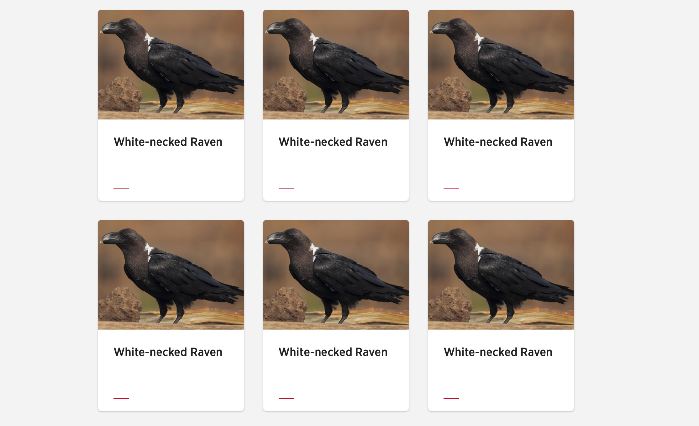
Base example
Note: you will likely use some sort of include for you card components. If not, replace the includes below with the HTML you need for your card components.
<section class="u-block u-block--grey">
    <h2>Base example</h2>
    <div class="b-cardgrid u-grid u-grid--3">
        {%include "card/data/card--base"%}
        {%include "card/data/card--base"%}
        {%include "card/data/card--base"%}
    </div>
</section>
Note: in our base example we use the grey block colour. If it fits with your page design, this is the preferred use-case as the white cards stand out more on the grey background.
Block details
| Card Grid block meta | values |
|---|---|
| handle | cardgrid |
| options examples | stack mod, CTA button |
| block colour options | u-block--white, u-block--grey |
| section use | <main> |
| width type | fixed |
| has heading | true |
| theme(s) | CU |
| variants | 3 column, 4 column |
| Codepen | https://codepen.io/cuweb/live/mdbwyEd |
Card Grid columns
The number of columns available for Card Grids differs from small screens and large screens.
Large screen Card Grid Options
On large screens, above RDS' small breakpoint of 768px, Card Grids rely on either three or four column grids. These are set by adding the respective grid modifier of either:
u-grid--3oru-grid--4.
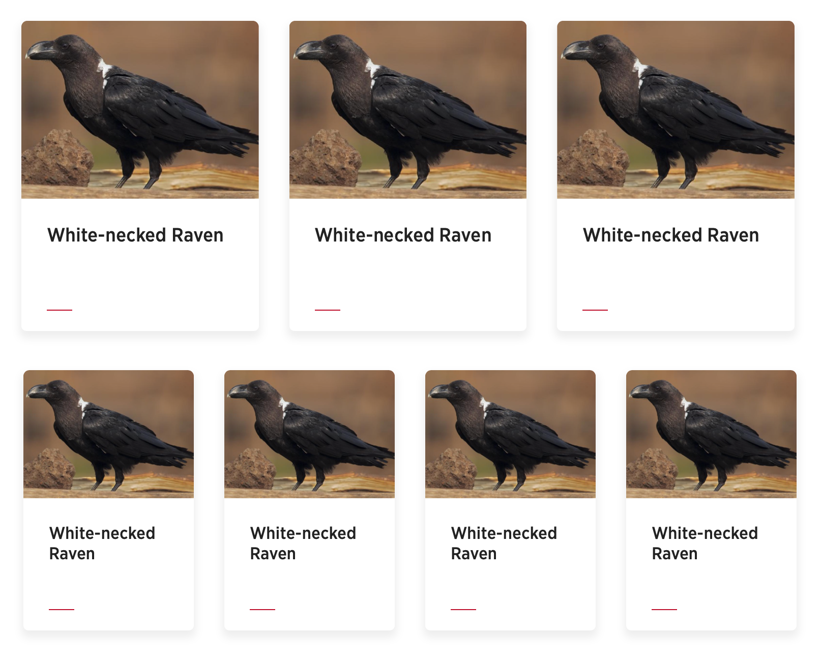
Three column grid code example
<section class="u-block u-block--grey">
    <h2>Base example</h2>
    <div class="b-cardgrid u-grid u-grid--3">
        {%include "card/data/card--base"%}
        {%include "card/data/card--base"%}
        {%include "card/data/card--base"%}
    </div>
</section>
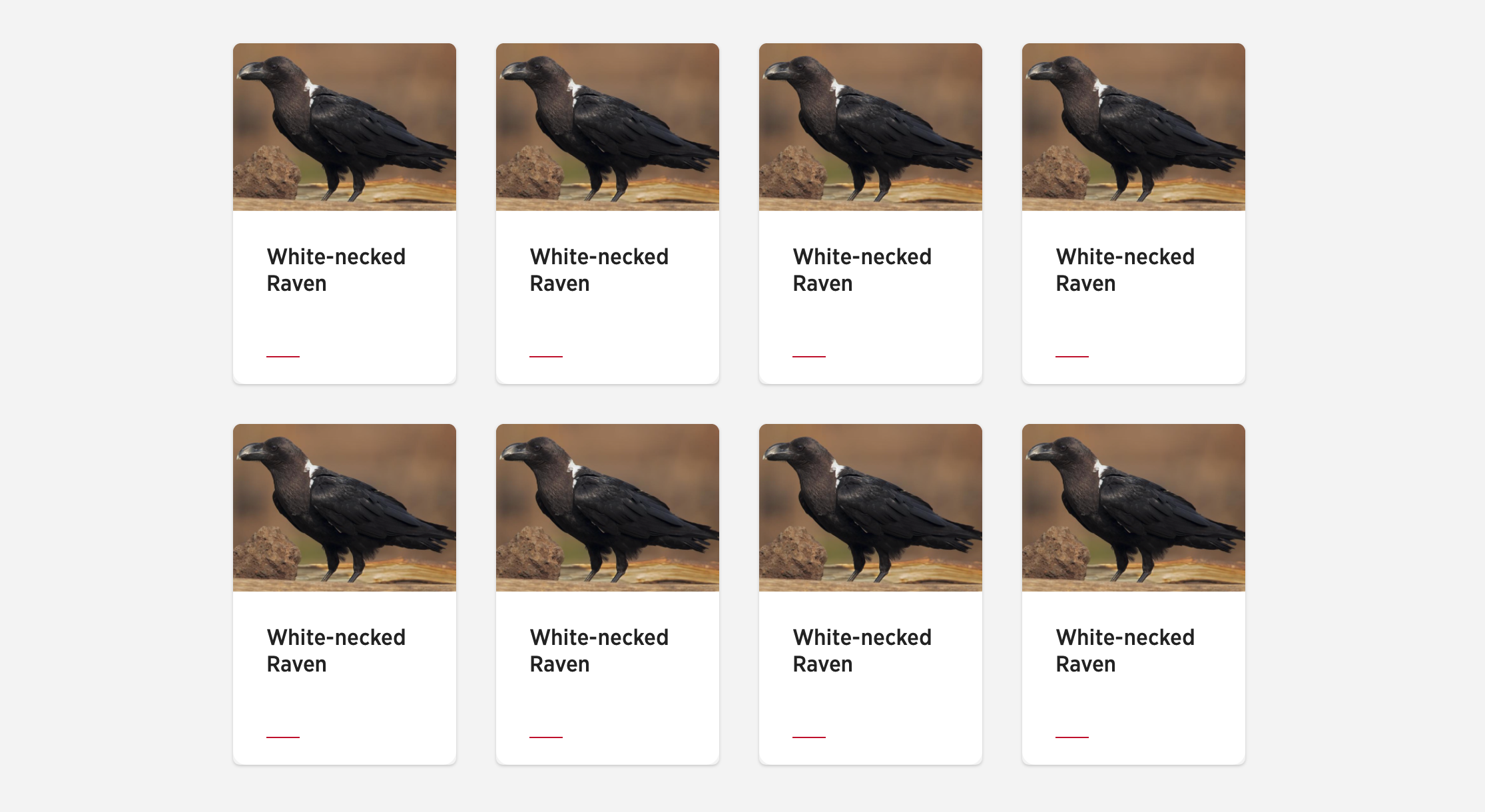
Four column grid code example
<section class="u-block u-block--grey">
    <h2>Base example</h2>
    <div class="b-cardgrid u-grid u-grid--4">
        {%include "card/data/card--base"%}
        {%include "card/data/card--base"%}
        {%include "card/data/card--base"%}
        {%include "card/data/card--base"%}
    </div>
</section>
Note: reminder
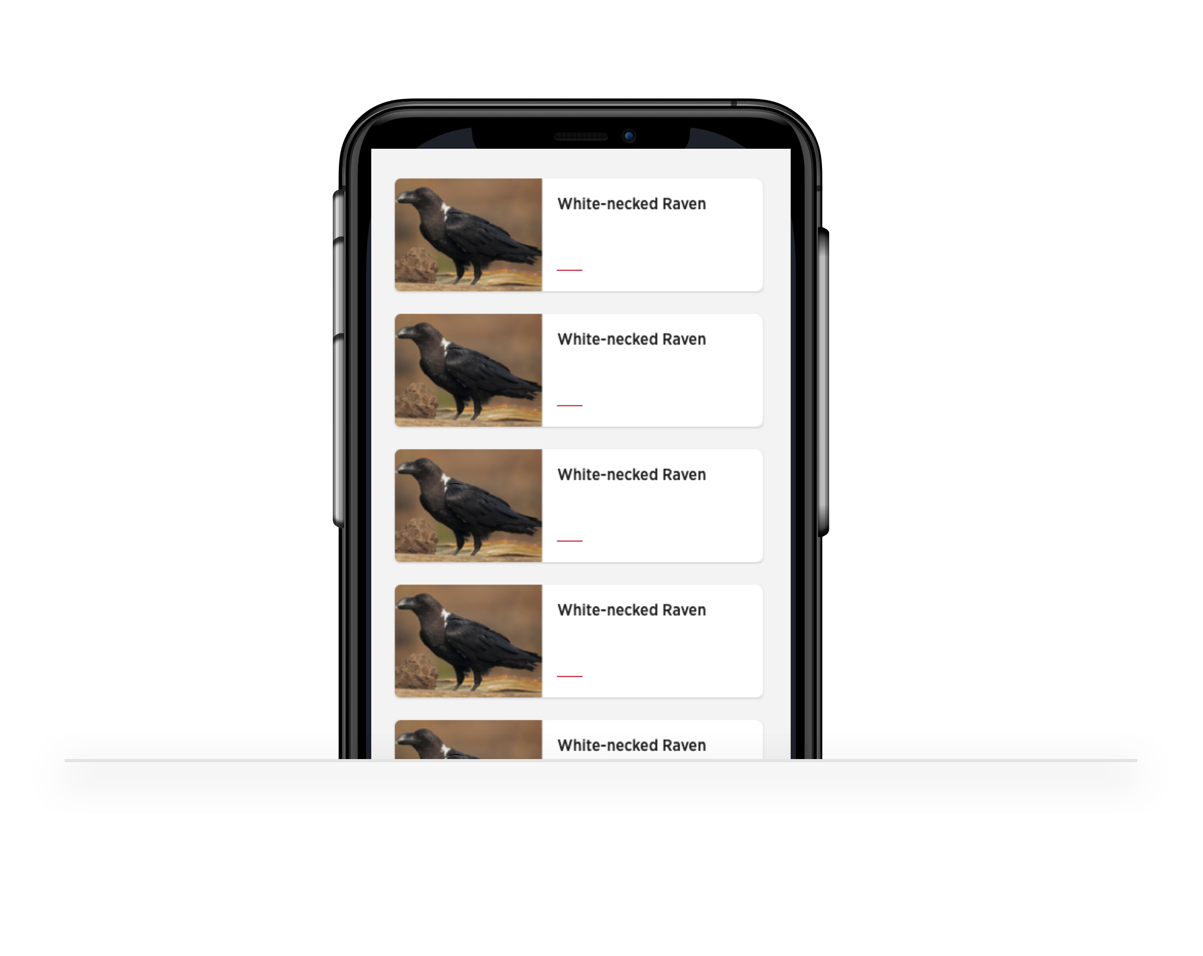
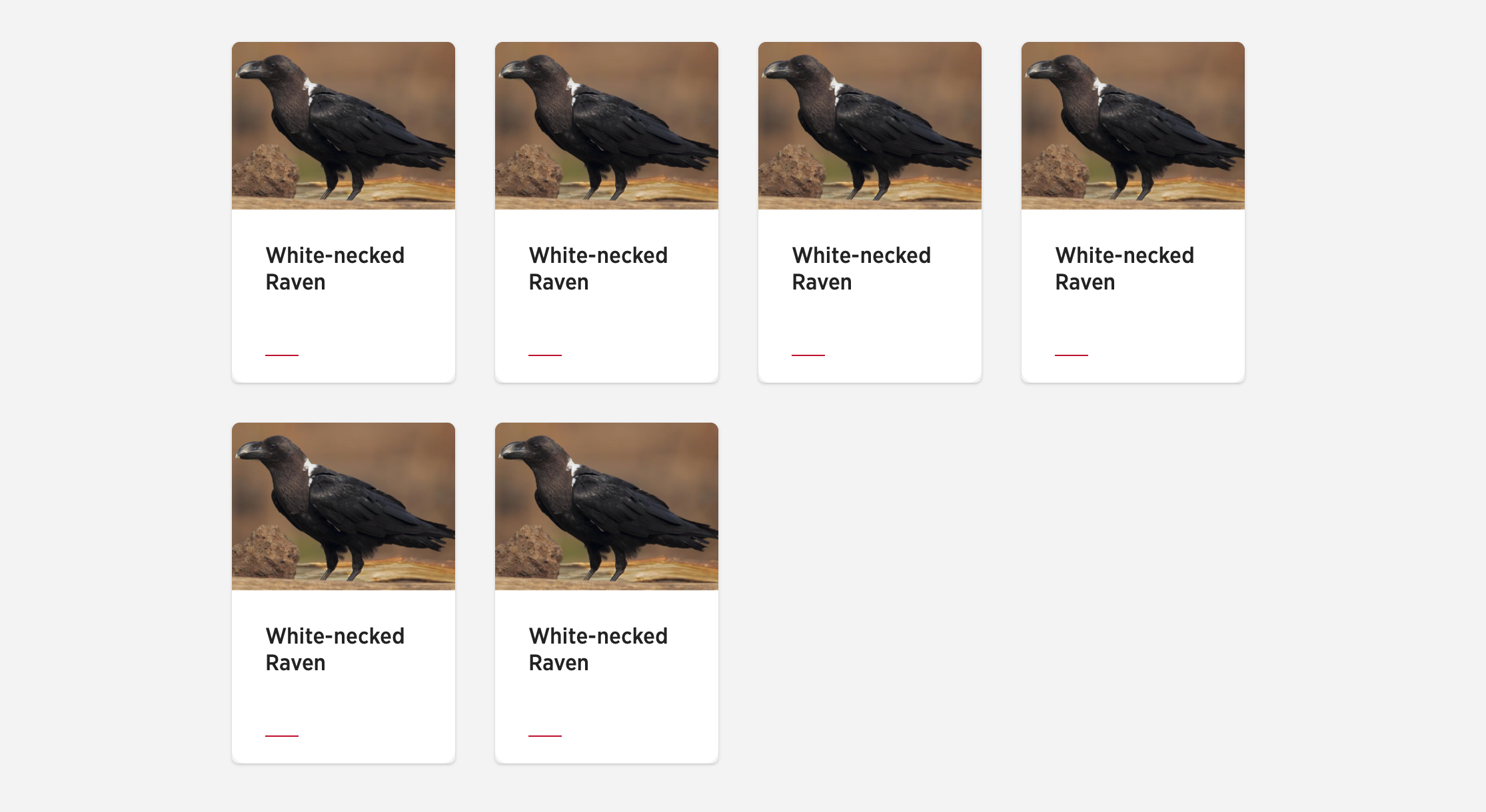
Small screen Card Grid: 1 or 2 columns
Single column default
Regardless of the modifier used to set your columns on large screens, on small screens the block defaults to one column. For an improved small screen experience, the look of the cards change from a vertical orientation to horizontal.
Two column mobile view
Two column views are available on small screens. When used, the cards get reverted back to their default vertical orientation.
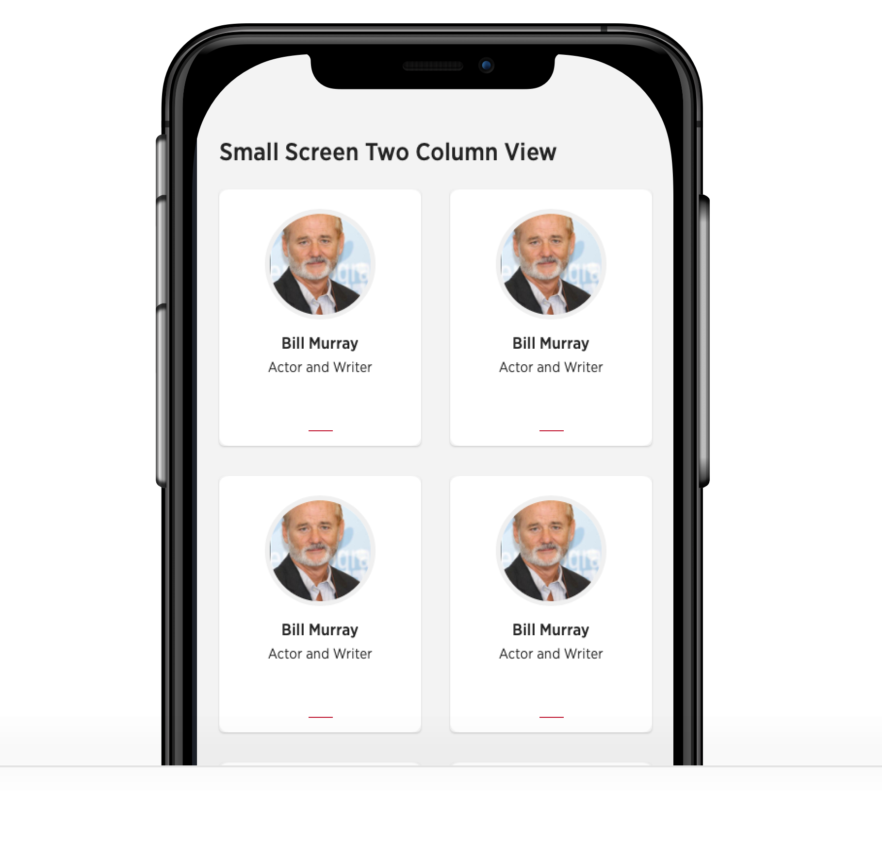
For a two column view on small screens, apply the block modfier .b-cardgrid--s2col. Where s = small and 2col = two columns.
The code below will display a two column card grid on small screens and a four column grid on large screens.
<section class="u-block u-block--grey">
    <h2>Base example</h2>
    <div class="b-cardgrid b-cardgrid--s2col u-grid u-grid--4">
        {%include "card/data/card--base"%}
        {%include "card/data/card--base"%}
        {%include "card/data/card--base"%}
        {%include "card/data/card--base"%}
    </div>
</section>
Important! Avoid grid item widows when using two columns on small screens
When setting two column grids for small screens, make sure your total number sof cards is an even number. For example, 4,6,8 or 12. Read the section below for more best practices in this area.
Card Grid rows and items
You can include as many card items as you want in Card Grid blocks. However, consider limiting the amount of cards in a single grid to 12. Beyond that, for a faster page load it is best to use some sort or ajax load more button for the user to request more cards. Lastly, for better performance make sure to include loading="lazy" on you Card images as all modern browsers will soon support native lazy loading.
Filling grid rows
It is important to try and avoid leftover grid cards and fill each row in the grid. To avoid grid item widows and orphans:
for three column grids insure your grid items total multiples of 3, for example:
- 3, 6, 9, 12
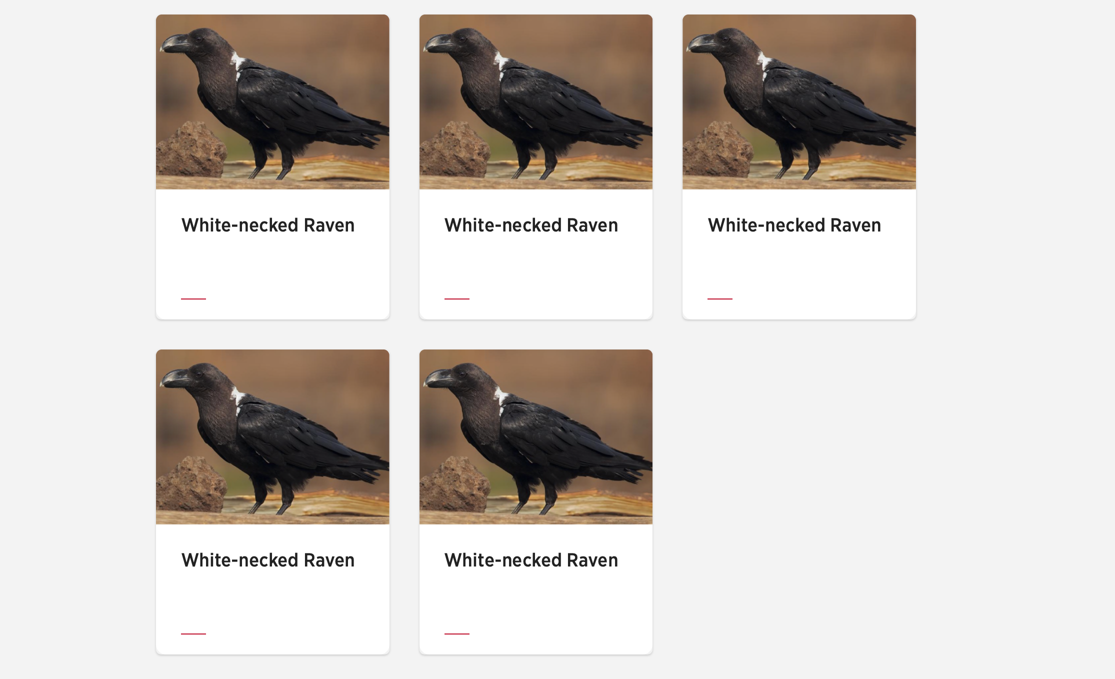
For four column grids insure your number of cards total to multiples of 4, for example:
- 4, 8, 12
Remember, if you are setting two column grids on small screens, you need to have an even number of grid items.
Card grid with CTA link or button
If you need a 'Load more' button under the card grid add it within the u-block tag but outside of the b-cardgrid tag.
<div class="u-block u-block--white">
    <div class="b-cardgrid u-grid u-grid--4">
        {%include "card/data/card--base"%}
        {%include "card/data/card--base"%}
        {%include "card/data/card--base"%}
        {%include "card/data/card--base"%}
    </div>
    <button class="c-buttoncta c-buttoncta--center" href="#">Load more</a>
</div>
Or, if you want to use a CTA to link off to an archive or another page.
<div class="u-block u-block--white">
    <div class="b-cardgrid u-grid u-grid--4">
        {%include "card/data/card--base"%}
        {%include "card/data/card--base"%}
        {%include "card/data/card--base"%}
        {%include "card/data/card--base"%}
    </div>
    <a class="c-buttoncta c-buttoncta--center" href="#">Visit archive page</a>
</div>
Related card content
The Card Grid block is intended for listing related content and in almost all cases the same card variants.

Avoid mixing different card variants as in the example above.